

-
- Managing Form Submissions
- Searching and Filtering Submissions
- Display Form Submissions on the Front-End
- Submission Context Tracking
- Customizing Submission Columns
- Editing Submissions
- Deleting Submissions
- Importing Submissions
- Exporting Submissions
- Exporting Submissions with a Webhook URL
- Tracking the User's IP Address
- Tracking the User's Country
- Disable Submission Storage
- Auto-Delete Old Submissions
- Auto-Save Each Submission to a JSON file
- Increment a Count on Each Submission
- Add a Unique ID to Each Submission
-
- Checkboxes
- Color Picker
- Confirmation
- Country
- Currency
- Date & Time
- Dropdown
- Email Address Field
- File Upload
- Hidden Field
- Icon element
- Number
- Page Counter element
- Password
- Phone Number
- Radio & Checkbox Images
- Radio Buttons
- Range Slider
- Rating
- Rich Text Editor
- Signature
- Terms of Service
- Textarea
- Textbox
- Website / URL Field
-
- Email the Person Who Filled Out the Form
- Send an Email Only When a Checkbox Is Checked
- Attach the Submission PDF to Emails
- Send Email Based on Drop Down Selection
- Send Different Email Content Based on Form Responses
- Set up Auto-Responder Emails
- Styling Emails with CSS
- Sending Plain-Text Alternative Body Emails
- Troubleshooting Email Delivery
- Tracking Sent Emails
- Resending Emails
-
- Browser Autocomplete for Form Fields
- Customizing Submission Date Created and Modified Formats
- How to Create a Quiz Form
- Centering forms
- Show Confirmation Popup After Submission
- Redirect to a Menu Item After Form Submission
- Use custom Google Font in your form
- Embed a Form in an External Website
- Copy Value From One Field to Another
- Add Placeholder Text to Fields
- Show a Form Only to Logged-In Users
- Add Custom CSS
- Adding an “Other” Option
- Show or Hide Form Fields Based on User Joomla User Group
- Scroll the Page to the Top When a Long Form is Submitted
- Populate Fields Using Query String
- Display Submissions Count for a Specific Form
- Populate Drop Down, Radio Buttons or Checkboxes with a CSV File
- Silently POST Submitted Data to Any API or URL
- Create a Custom Login Form
- Auto-Populate Fields with Article Data
- Add a placeholder text to a Dropdown field
- Create Multilingual Forms in Joomla
- Redirect User to a URL After Form Submission
- Importing and Exporting Forms
- Display Convert Forms in a popup
-
- CSRF Token
- Does Convert Forms Use Cookies?
- Minimum Time to Submit
- Restrict Form Submissions Based on IP
- Enforcing a Custom Password Policy in Convert Forms
- Add ALTCHA Proof of Work to your Joomla form
- Add Cloudflare Turnstile to your Joomla Form
- Implement the Iubenda Consent Database in Joomla with Convert Forms
- Add Custom Validations to Fields and Forms
- Add Math Captcha to your Form
- Prevent a Field From Saving in the Database
- Add hCaptcha to your Form
- Enable Double Opt-in
- Allow Form Submissions in Specific Date Range
- Ensure a Unique Value is Entered Into a Field
- Block Form Submissions Containing Profanity (Bad Words)
- Block Email Addresses or Email Domains
- Honeypot
- Setting Up Google reCAPTCHA
- Create GDPR Compliant Forms
-
- Troubleshooting Spam Submissions
- Updating from Convert Forms 5 to 6
- Troubleshooting Form Submission Errors
- Troubleshooting Form Rendering Issues with Joomla Cache
- Frequently Asked Questions
- Troubleshooting Issues with the Joomla Email Cloak Plugin
- Campaigns Feature Is Deprecated: Migrate to Tasks
- Prevent Form from Getting Covered by a Sticky Menu Bar
- Troubleshooting Convert Forms
Form design
Style your whole form from the Design panel, and give a single page or ending its own colors.
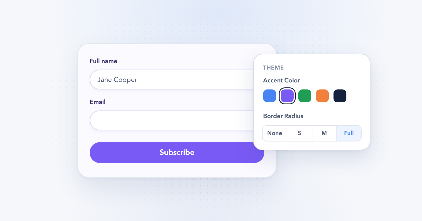
Heads up: this feature is new in Convert Forms 6 and is only in the latest beta release. On Convert Forms 5, this page won't match your backend. Download the beta and back up your site first.
The Design panel sets how your whole form looks: fonts, colors, spacing, inputs and buttons. Every change shows in the preview right away.
- Log into your Joomla backend.
- Go to Components → Convert Forms → Forms.
- Open your form.
- Click Design in the left sidebar.
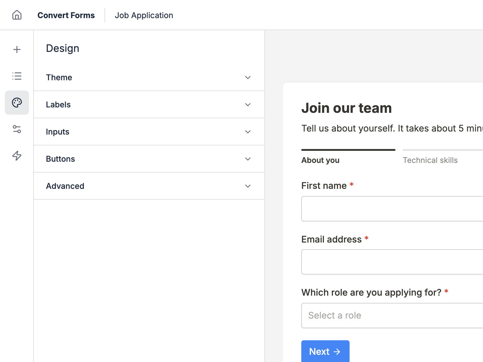
The settings sit in 5 groups: Theme, Labels, Inputs, Buttons and Advanced.
Theme
The font, colors and spacing of the whole form. The other groups build on these.
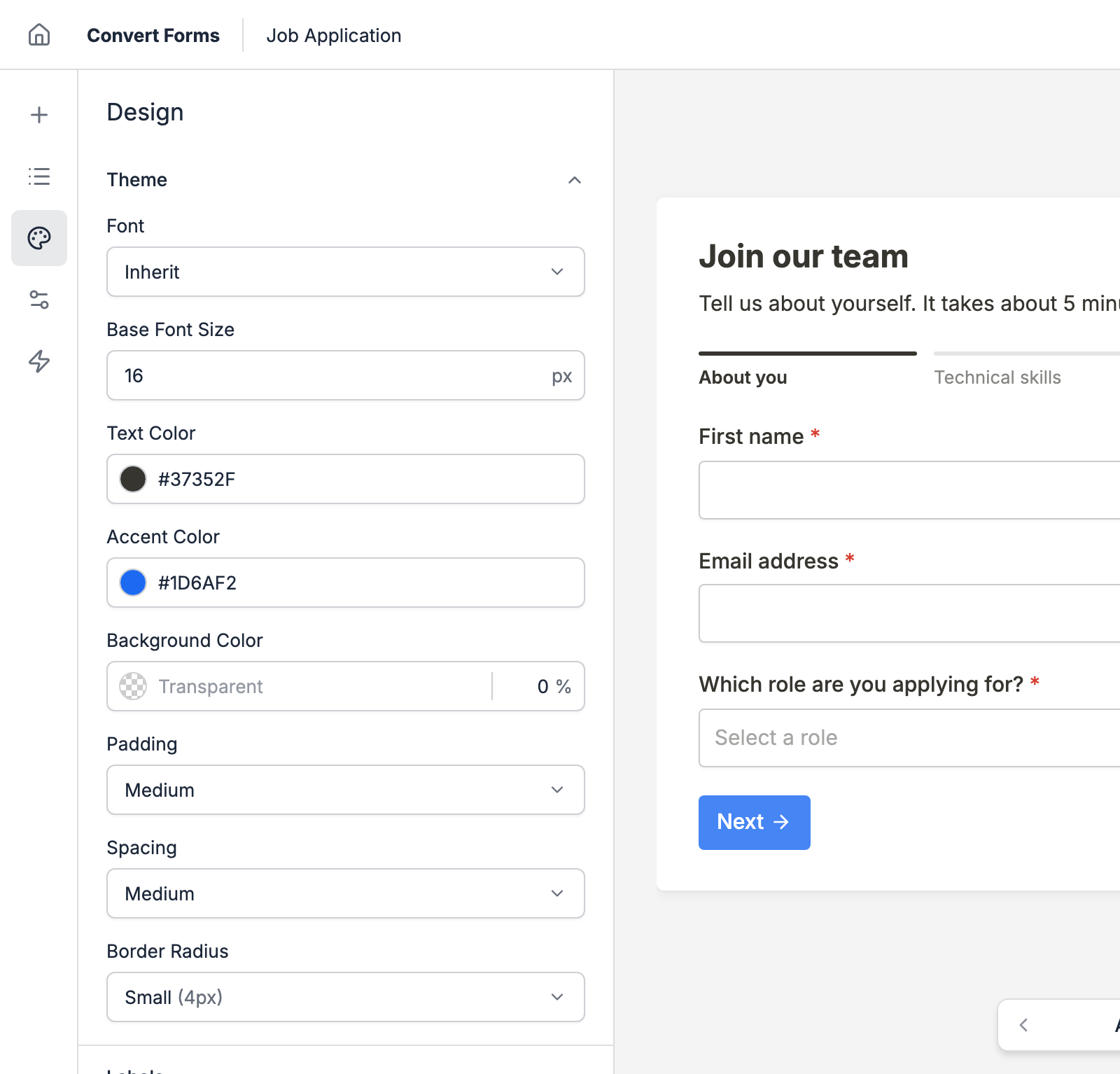
- Font: the font of the whole form. Inherit uses your site's font. A Google font loads from Google, which adds a request to the page.
- Base Font Size: the size every Font Size and Padding preset scales from. Change this 1 number and the labels, inputs, buttons and headings follow.
- Text Color: the color of every text on the form: labels, inputs, help text, headings and HTML content.
- Accent Color: the color of links, the focus ring on inputs, and checked boxes and radios.
- Background Color: the color behind the whole form. It's transparent by default, so your page shows through. The builder's preview always shows the form on white.
- Padding: the space between the form's edge and its content. Set some whenever you give the form a background color, or the fields touch the edges.
- Spacing: the room between elements, and between a label and its input.
- Border Radius: how rounded the corners of every input and button are, from None to Full. Pick Custom to set it in pixels.
Labels
How the label of each field looks and where it sits.
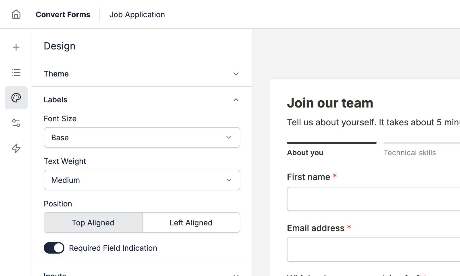
- Font Size and Text Weight: the size and boldness of the labels.
- Position: Top Aligned puts each label above its input. Left Aligned puts it on the left.
- Required Field Indication: adds an asterisk next to the label of each required field.
Inputs
How the boxes visitors type in look: their text, colors, shadow and padding.
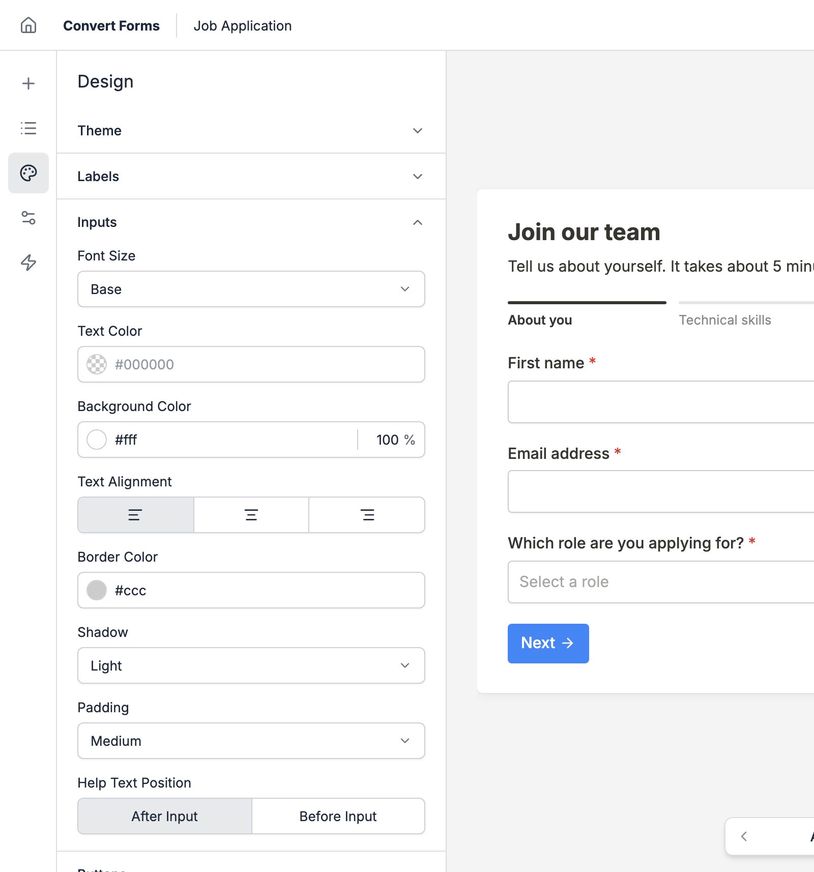
- Font Size: the size of the text visitors type.
- Text Color: the color of what visitors type. Leave it empty to use the form's Text Color.
- Background Color and Border Color: the inputs' fill and outline.
- Text Alignment: Left, Center or Right.
- Shadow: None, Light, Medium or Strong.
- Padding: the room inside each input around its text. Pick Custom to set the vertical and horizontal padding in pixels.
- Help Text Position: shows a field's help text before or after its input.
Buttons
The look of every button on the form: Submit, plus Next and Back on multi-page forms.
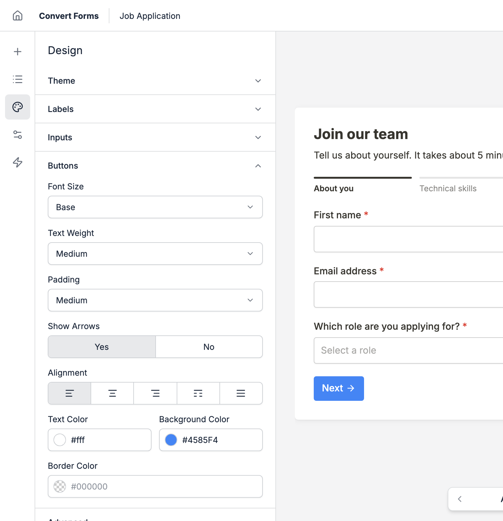
- Font Size, Text Weight and Padding: the size of the buttons.
- Show Arrows: adds an arrow next to the Back, Next and Submit labels.
- Alignment: Left, Center or Right. Space Between puts Back at the left edge and Next or Submit at the right, and Stretch spreads the buttons across the whole row.
- Text Color, Background Color and Border Color: the buttons' colors. Leave Border Color empty for no border.
Advanced
Content above and below the form, plus your own CSS and JavaScript.
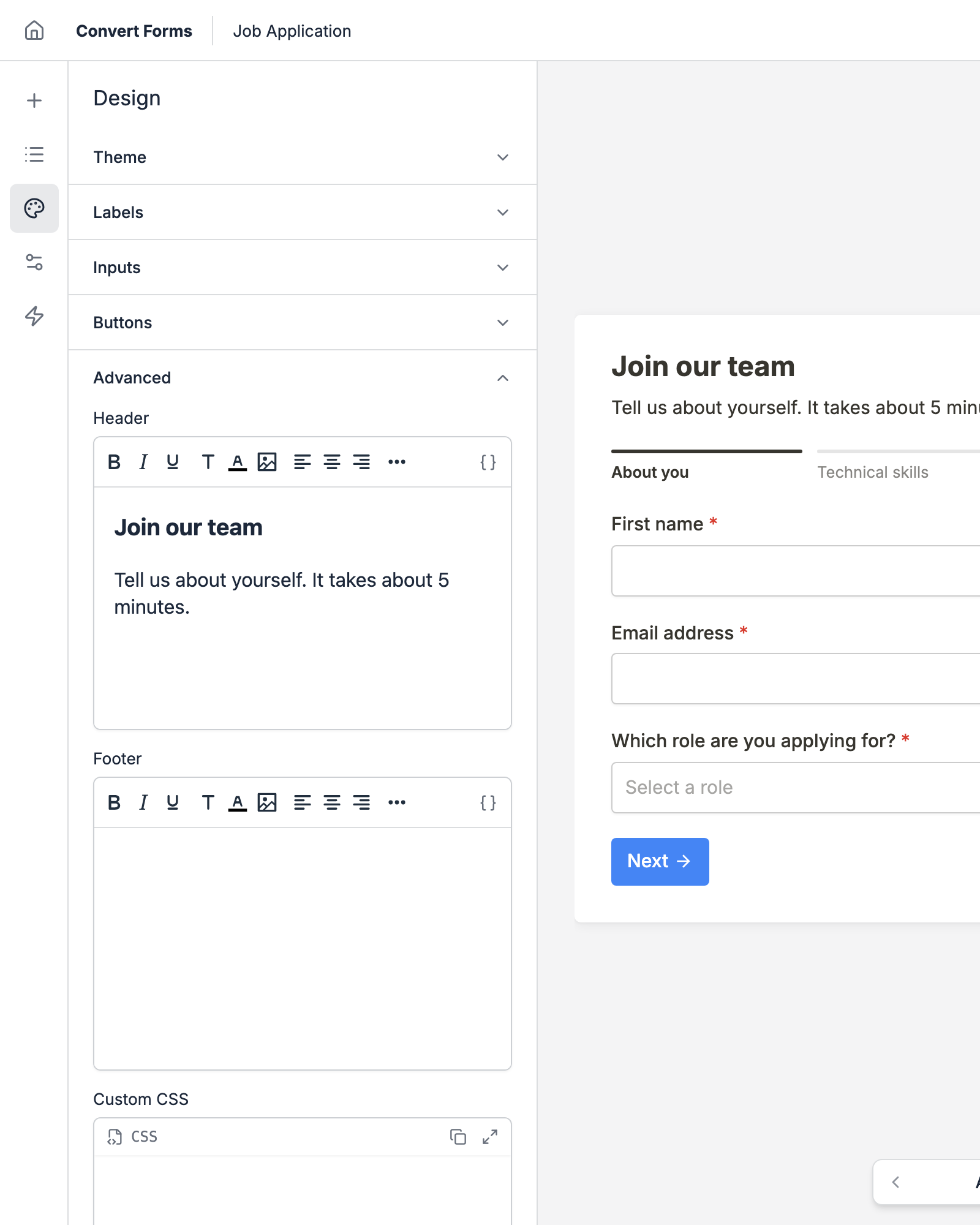
- Header: text, images or HTML above the form, like a title and an intro. It shows on every page and hides once the ending shows.
- Footer: text or HTML below the form, like a privacy note.
- Custom CSS: your own CSS for this form. It also runs in the builder, so you see the result in the preview. See Add Custom CSS.
- Custom JavaScript: your own JavaScript for this form, without
<script>tags. It doesn't run in the builder. - Class Suffix: a CSS class added to the form, for styles you keep in your template.
Go further with CSS
Last updated on Nov 10th 2026 14:11
The #1 Joomla Contact Form Builder Extension
Create contact forms, payment forms, registration forms, calculator forms with the most user-friendly Joomla contact form builder extension.

Tassos offers a premium suite of Joomla extensions with 7 products and over 2.5 million downloads, providing reliable solutions since 2014.


 Rated:

Copyright © 2014 - 2026 - Smile Motive Development LP. All Rights Reserved.